A brief introduction.
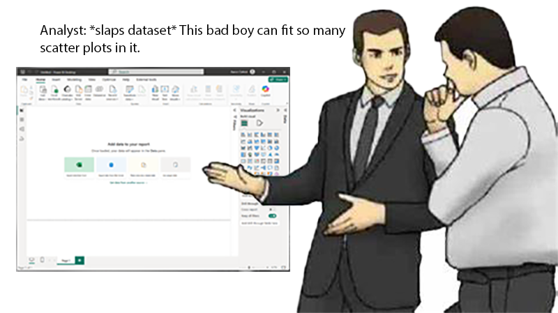
Here’s the situation: You’ve been asked to analyze a metric like maintained gross profit margin by using scatterplots and linear regression analysis, all driven by an existing Power BI Dataset. The first thought?
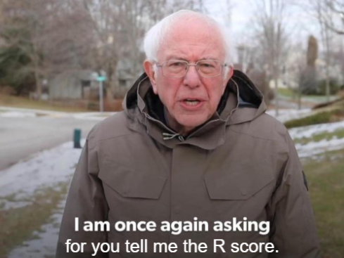
Why is the R score missing?
But the inevitable question arises, “How’s the fit? Where’s the R-value?” And now you’re thrust into an existential crisis. Is any of this all worth it? Outside, the day beautiful and the birds singing a soft song through your open window. They don’t have to fret data fitting or turn-arounds. But you do, so get on with it, dang.
Where could it be now?
You can look, but there’s no score. Then, like a bolt of lightning, it hits you. You are a smart guy or gal. You don’t need Power BI’s anemic scatter plots. You need the power of RStudio.
Once again, the reality of the request sets in like the yoke of an ox. How will you visualize it? Create a graph for every possibility? Even then, how will they be presented? Will they go in a deck? The deliverable is a Power BI report friend, we’re heading in the wrong direction.
Okay, maybe you can use excel to connect to the data model and setup a pivot table from the measures and…
And once more, wrong. At last, you’ve reached rock bottom. Only then will the worst of all solutions will rear its monstrous head. The useless phrase, “So and so from such and such department suggests a paid plugin they saw.”
If that’s your solution, you might be better suited here.
And then, when all hope is lost, you remember…
You’re just a chill guy who loves to connect R with Power BI.
What’s the plan?
We are going to unite the statistical power of R, the flexibility of ggplot2, and immense display and filtering capabilities that a Fabric/Power BI semantic model offers us to achieve our visualization goal. That goal being scatterplots with the linear regression graphed as well as the corresponding scores.
Download The Source Files:
If you already have R installed, you can clone or download the Power BI Project linked below. If not, install R and THEN open the file in Power BI.
Get in sync.
We need to ensure R is installed, and the ggplot2 has also been installed. This is most easily achieved via RStudio and there are a ton of great tutorials to set you up there, like this one: How to Install ggplot2 in R: A Comprehensive Guide | R-bloggers.
Great, now that you have R installed, let’s move on to enabling it in Power BI.
How to enable R in Power BI Desktop.
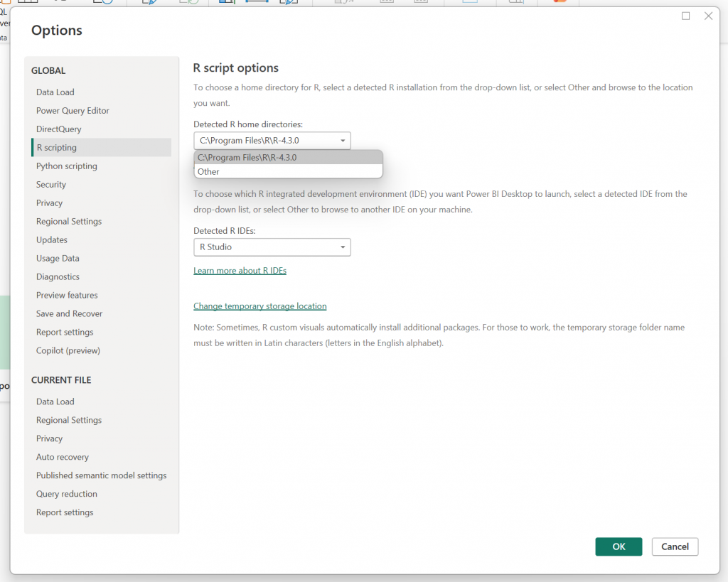
This is pretty straight-forward but follow the steps below, starting at the menu to open the options. Then navigate to R scripting and choose your R installation. It may well be selected for you already. This will allow Power BI to execute R scripts in the visualization window.
File > Options and Settings > Options
The code part.
One assumption I made at the start of this, is that we will be using an established dataset and generating new visuals. In order to do that, we need a dataset and some semantic relationships and some DAX and blah blah blah. I prepared all that for you. Please note the following downloads:
We will use the Adventure Works dataset, which can be downloaded here as of today, March 4th, 2025. It will be bundled with the PBIX, but here is the source: microsoft/powerbi-desktop-samples · GitHub
Then, you can also download my .pbip file to follow along from the beginning here: GitHub: scatterplots_start: A Power BI Project to support learning visual integration of R, ggplot2, and Power BI.
Begin.
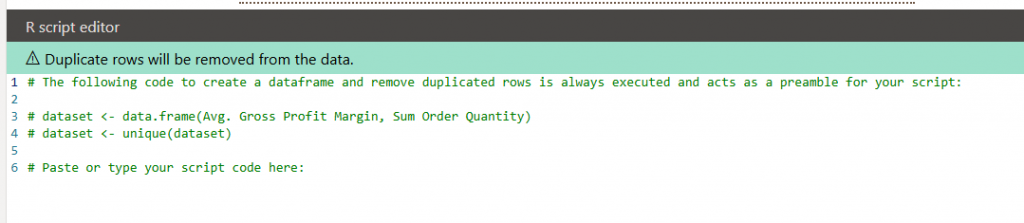
Create an R visual on an empty page. That action will create the following prompt.
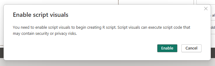
Enable the visual and add a table visual alongside.
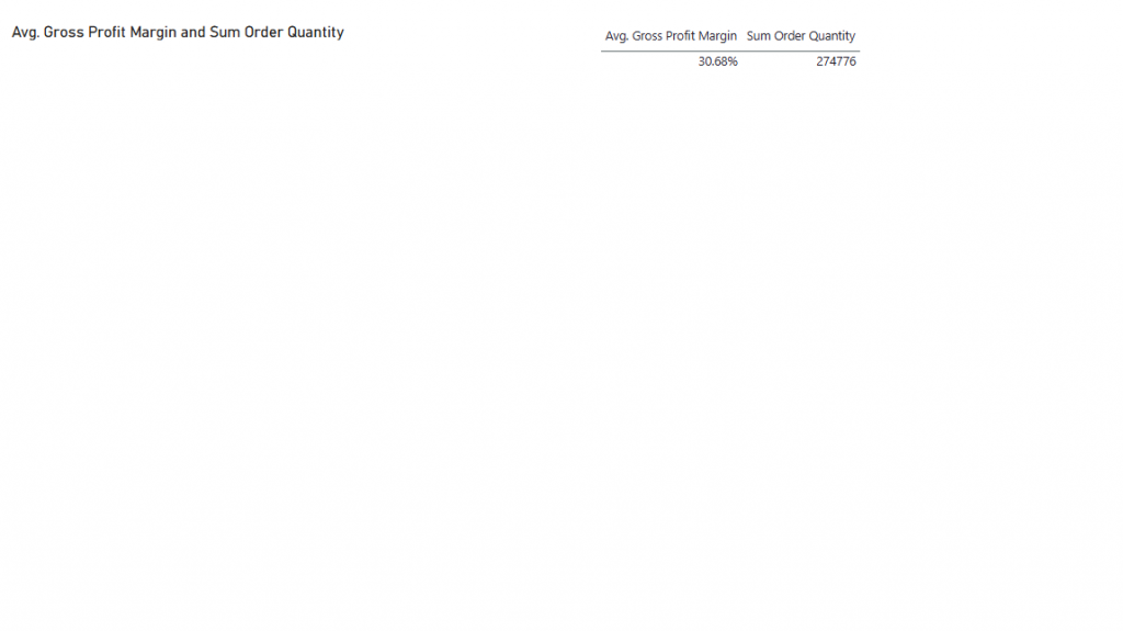
Now add the two measures below [Avg. Gross Profit Margin] and [Sum Order Quantity] to both visuals. It should look like this.
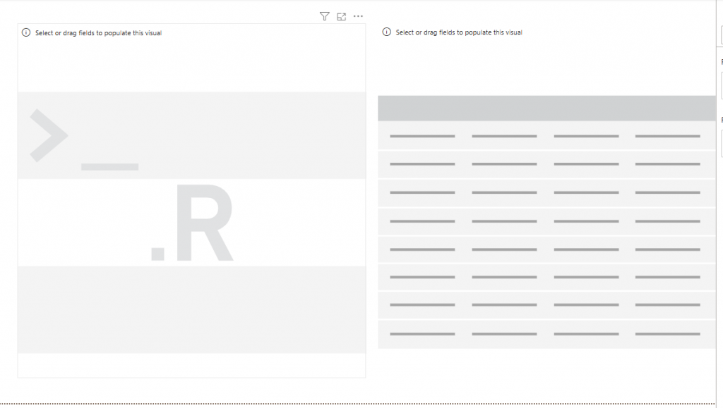
When you select the R visual, a text editor will pop up and explain how the dataframe is formed. We are creating the table visual to verify that we understand what is in our dataframe. Notice how the table generated for your R visual will be deduped.
Let’s add some dimensions to our data to make it more interesting.
“That’s not Data.“
”What?“
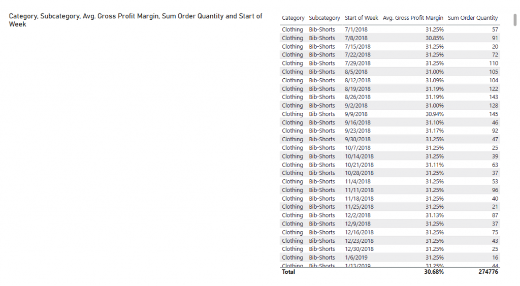
We want to add [Category] and [Subcategory] from the Products table, and [Start of Week] from the Date table.
The final result should look like this.
Sidebar
R doesn’t love spaces in measure or dimension names. Here’s how to compensate for that and save your naming structures too.
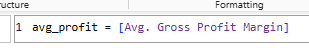
I created alias measures to use with R. You should too.
You can see here how they are applied to the construction of the table. Just re-naming there here won’t work. Much easier than compensating for the spaces in the measure names.
First Code Block
We are going to create the visual, then add the linear regression line, then calculate and output the linear regression results.
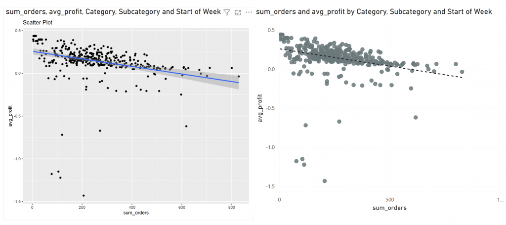
library(ggplot2) # dependency
ggplot(dataset, aes(x = sum_orders, y = avg_profit,)) +
  # sets the visual type
  geom_point() +
  # sets the labels
  labs(x = "sum_orders", y = "avg_profit" ) +
  # adds a linear regression line
  geom_smooth(method = "lm")
This will create the initial visual, which we can see matches a similarly created scatterplot from Power BI.
What’s the score?
Now that we have the visual, we can calculate the R score and display it. One caveat to working with R in Power BI visualization engine is that the final result needs to be an image. It’s not enough to only calculate the scores, they have to output, and for that, we will need another library.
Same Bat Channel
In part 2 we will add additional libraries to our R visualization and finally add the daunted R-score. See you then! -AC
Leave a Reply